


JSON Viewer for Creatio
Overview
Product overview
JSON Viewer for Creatio: Transform raw JSON text fields into interactive, searchable, and beautiful visual components.
Stop forcing your users or administrators to read unformatted, raw JSON strings inside Creatio. JSON Viewer for Creatio is a custom component for Freedom UI Designer that instantly turns any unlimited-length text field containing JSON data into a clean, structured, and interactive tree view.
Designed for displaying API integration logs, audit trails, or complex configuration data stored within your Creatio records.
Key Features
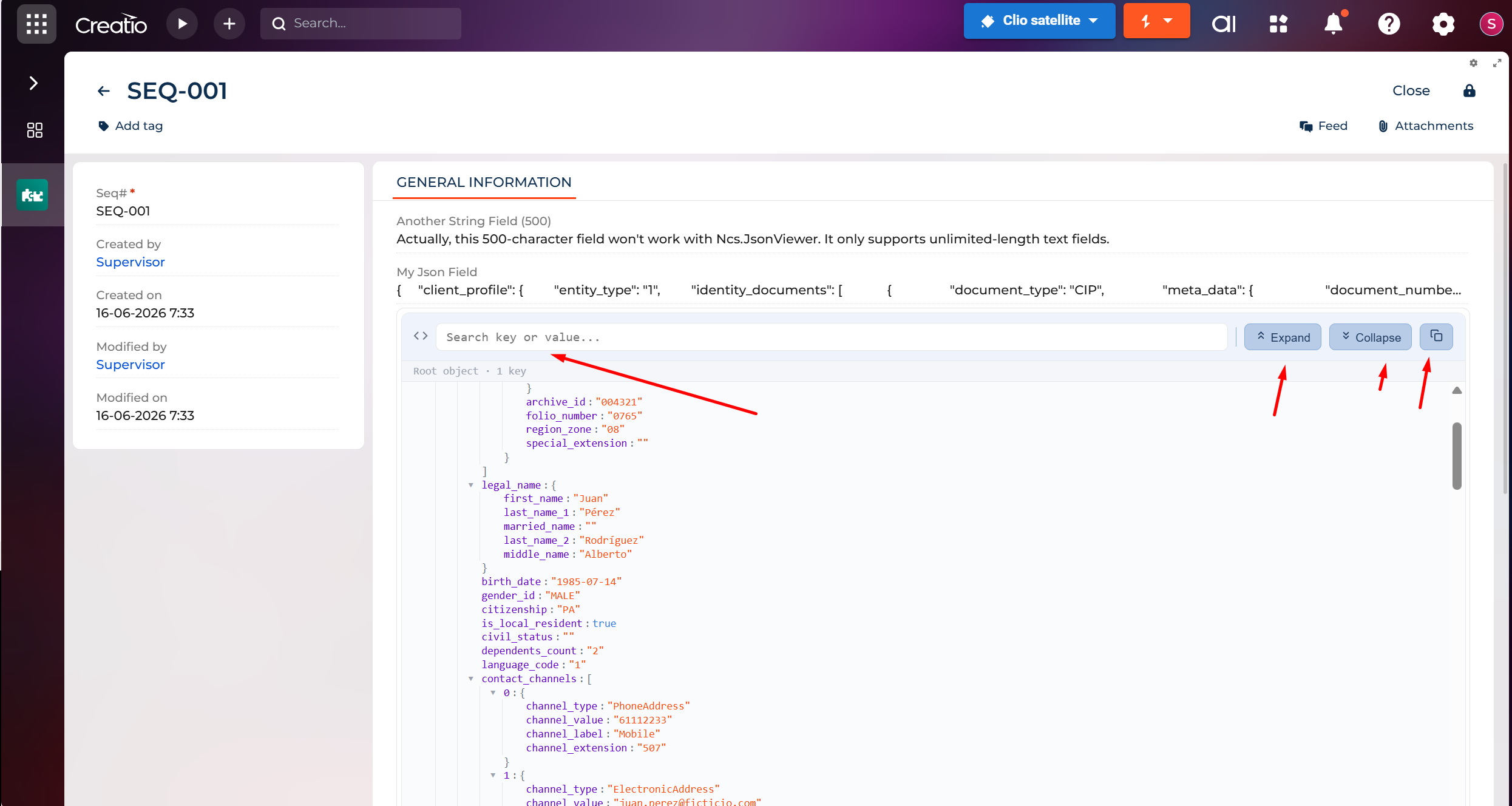
Interactive JSON Tree
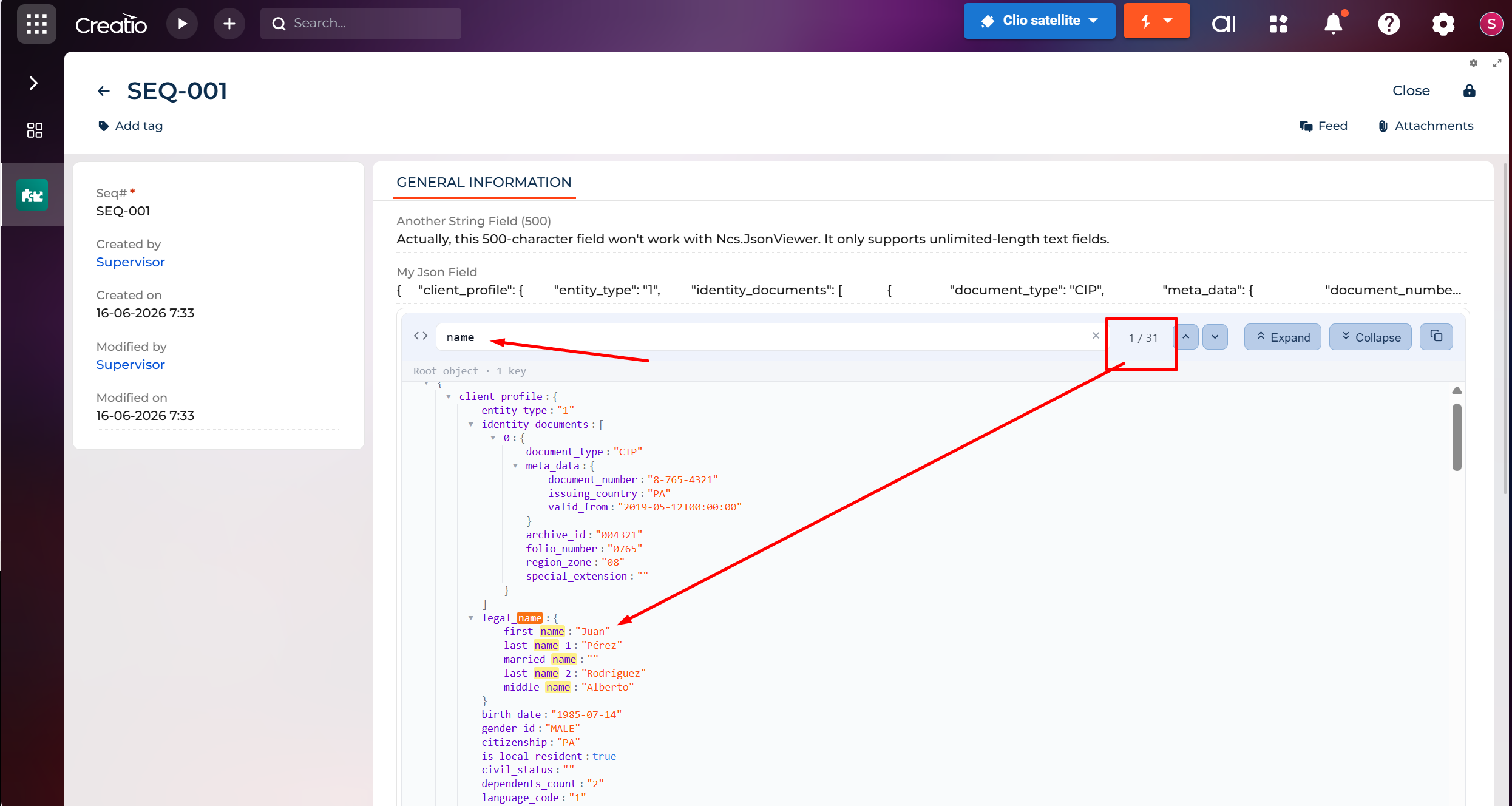
Real-Time Search
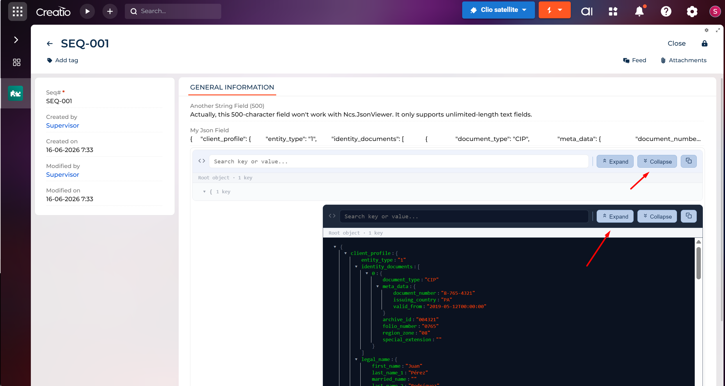
Expand / Collapse
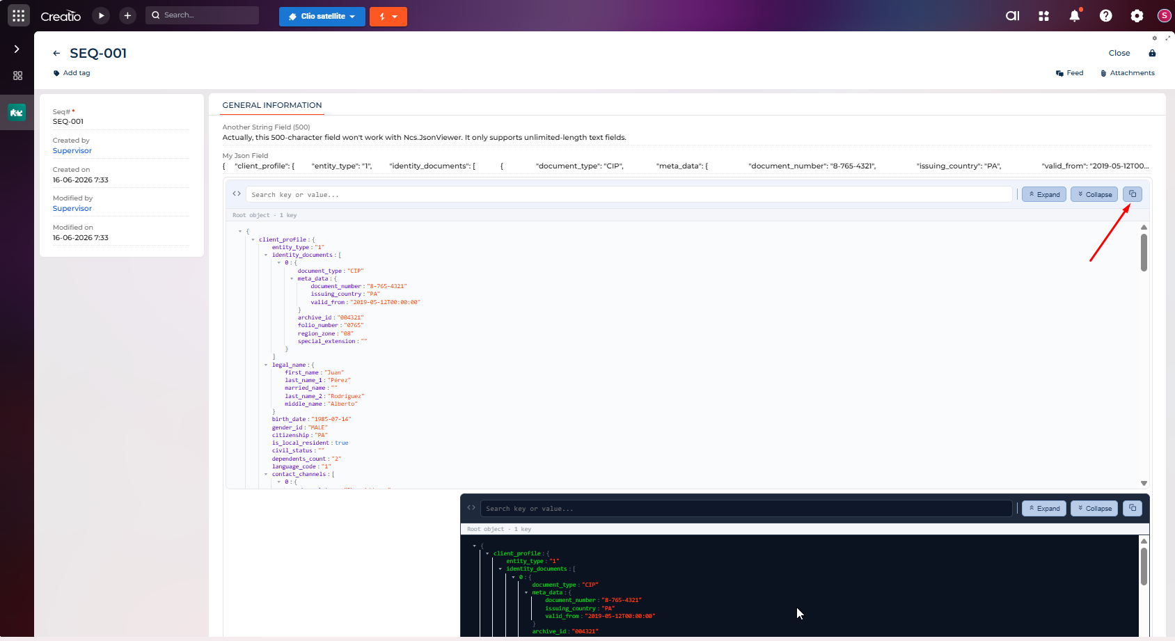
Copy to Clipboard
Pricing
Terms and Conditions
Support
Installation
Setup guide
Installation
- Install the package from the Creatio Marketplace.
- In the package your Freedom UI page belongs to, add NcsJsonViewer as a dependency (your package must inherit from it for the component to be available in the designer).
- Open the FormPage Designer for the page where you want to show JSON data.
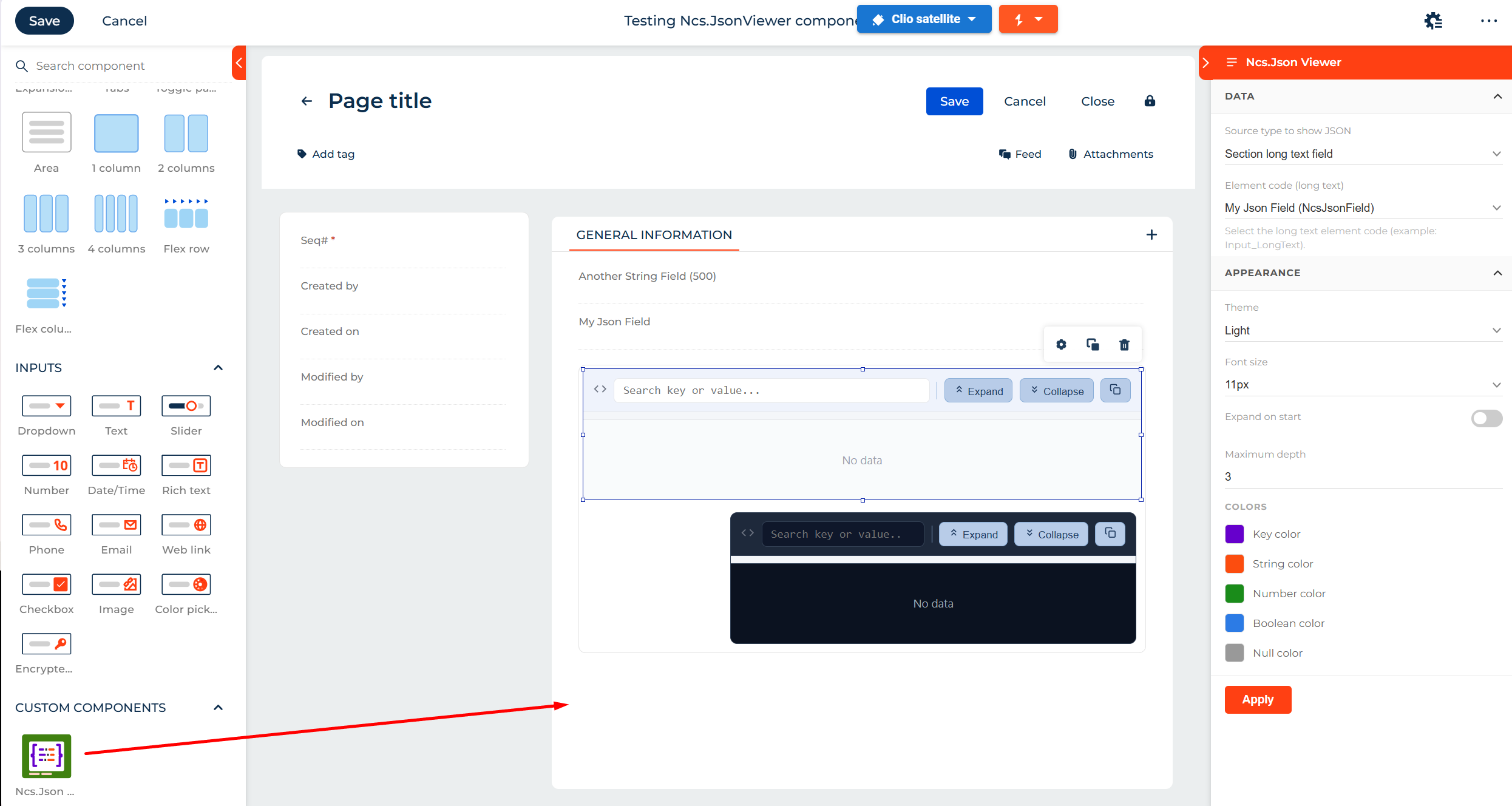
- Scroll to the bottom of the components panel to the CUSTOM COMPONENTS section. The component appears there as Ncs.Json Viewer, identified by its green code-brackets icon.
- Drag the component onto the page canvas.
- Click the component to open its setup panel on the right: configuration works the same way as any out-of-the-box (OOTB) Creatio component.
Note: the component can only read data from unlimited length text fields.
Setup Panel Reference
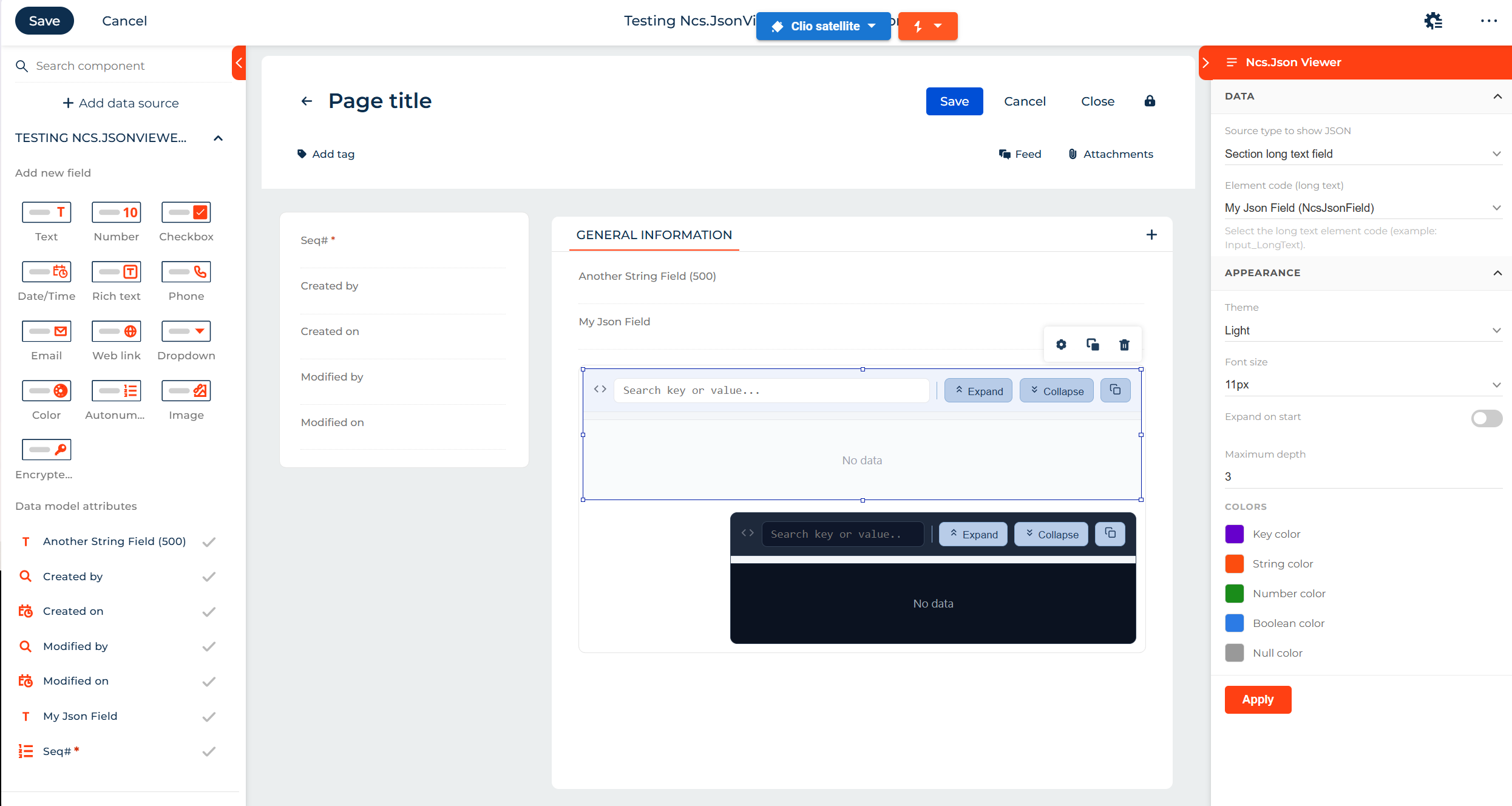
The setup panel is organized into three collapsible sections: Data, Appearance, and Colors.
1.- Data
| Field | Description |
|---|---|
| Source type to show JSON | Selects where the JSON comes from. Currently supports Section long text field. |
| Element code (long text) | Dropdown listing the page's unlimited-length text elements (e.g. My Json Field (NcsJsonField)). Select the field whose content should be rendered as JSON. |
Helper text shown in the panel: "Select the long text element code (example: Input_LongText)."
2.- Appearance
| Field | Description |
|---|---|
| Theme | Dark or Light. Matches the viewer's palette to the host page style or user preference. |
| Font size | Adjustable text size (e.g. 11px) for readability. |
| Expand on start | Toggle. When on, the JSON tree renders fully expanded on load instead of collapsed. |
| Maximum depth | Numeric value (e.g. 3) controlling how many nested levels are expanded/rendered by default. |
3.- Colors
Individual color pickers, each with a swatch preview:
- Key color: color for object keys
- String color: color for string values
- Number color: color for numeric values
- Boolean color: color for true / false values
- Null color: muted tone for null values
Click Apply at the bottom of the panel to save the configuration.
Rendered Component
Once configured, the component renders on the page as a self-contained viewer with:
- A search box (Search key or value...) to filter by key or value
- Expand and Collapse buttons to control the whole tree at once
- A copy icon to copy the JSON content to the clipboard
- The JSON tree body itself, styled per the Theme/Colors settings; shows "No data" when the bound field is empty
Examples
Light theme: white background, dark text, colored keys/values per the palette configured in the setup panel. Same toolbar (search, Expand, Collapse, copy) and same empty-state message when unbound.
Dark theme: dark navy background, light text, same toolbar and controls. Only the palette changes, driven entirely by the Theme and Colors settings - no separate component or configuration needed.
Data sharing
- By installing or downloading the App, you confirm that you agree with sharing your account data (name, email, phone, company and country) with the App Developer as their End User.
- The App Developer will process your data under their privacy policy.
Versions
Versions history
Fully Configurable JSON Viewer for Freedom UI
This release introduces a highly customizable JSON viewer component designed for Creatio Freedom UI Designer. It stands as one of the first custom UI elements fully built on the Remote Module capability introduced in Creatio 8.3.3. JSON viewer component provides the following capabilities:- Color Customization per Data Type
- Dark / Light Theme
- Configurable Display Options
Manual app installation
- Open the needed app → the Packages tab - download the Markeplace app files.
- Click in the top right → Application Hub
- Click New application. This opens a window.
- Select Install from file and click Select in the window that opens.
- Click Select file on the page of the Marketplace App Installation Wizard and specify the app file path.